Piperbear | BRANDING
Project overview
Piperbear is known for their high-end, boutique rental properties which they renovate, design, and manage themselves. Their services were expanding to include interior design and renovation planning for homeowners. Ready to grow their business, Piperbear looked to BigTree to help align this new area of their company with what they were currently offering.
Main branding goals
- Create a unified identity for Piperbear Properties and Piperbear Designs
- Create an identity focused towards high-end buyers and renters
- Convey an identity that feels modern, high-end, sophisticated, and makes people feel taken care of, part of the Piperbear family
The essence
We began with their two company names and distilled it down, housing it all under one identity. Piperbear. Simple, intriguing, and doesn’t restrict them to a specific service. Next, we immersed ourselves in their world and focused on aligning their mission and values with their visual identity.
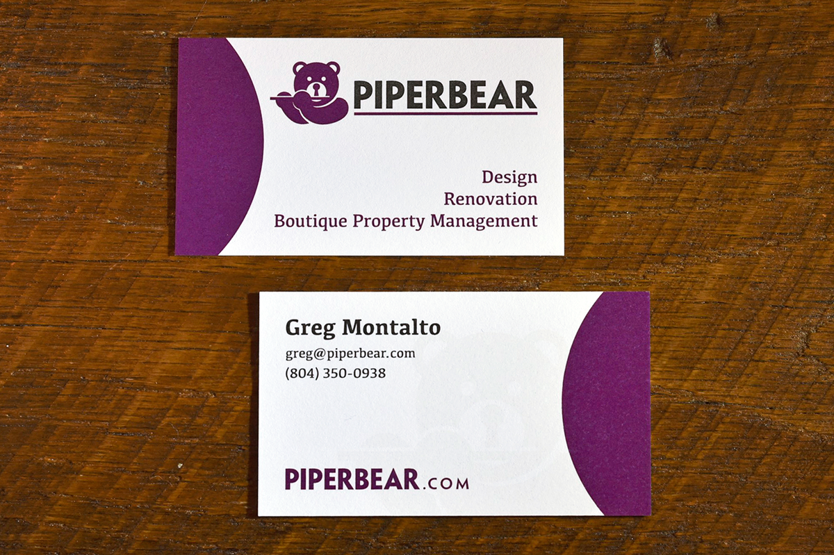
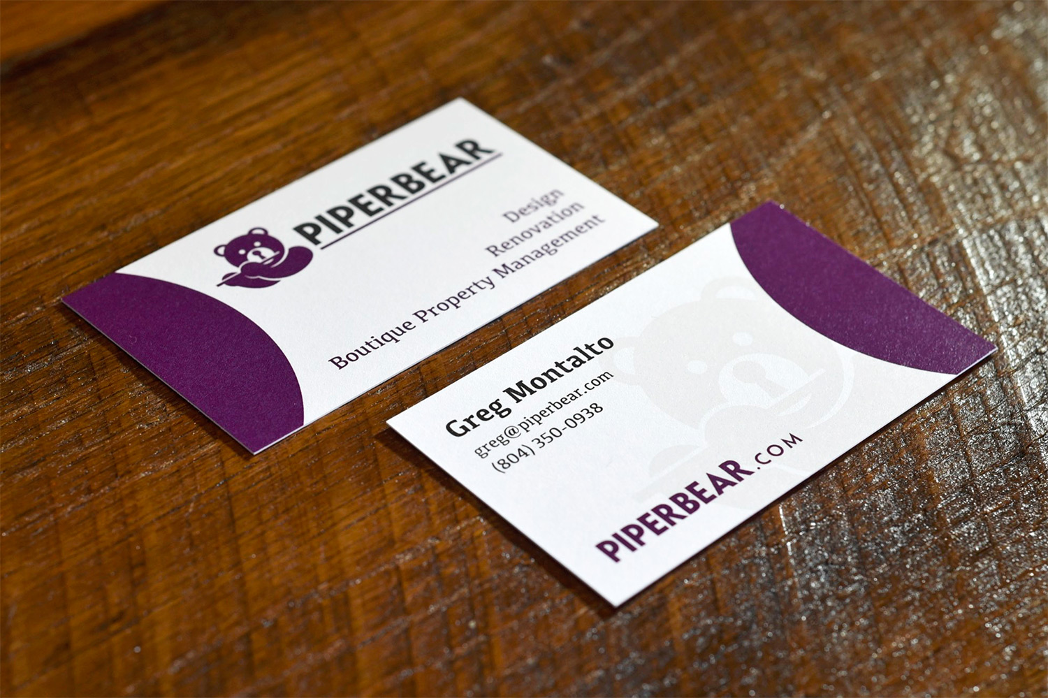
The logo needed a refresh. We focused on the typography, choosing a geometric typeface with circles and right angles that feels modern, high-end, and intentional. From there we turned our attention to the bear—Nicole and Greg’s alter egos combined into one entity. The backstory and concept behind the bear were great—the little guy just needed to be taken to the next level. We created a new bear with angles and curves that mimics the new typeface; designed the bear's nose to throw a subtle nod to their industry; and chose a color palette that evokes feelings of creativity, passion, and confidence.
After perfecting and obsessing over meaning, alignment, shape, and spacing, the new Piperbear logo is ready to shine.
Finishing touches
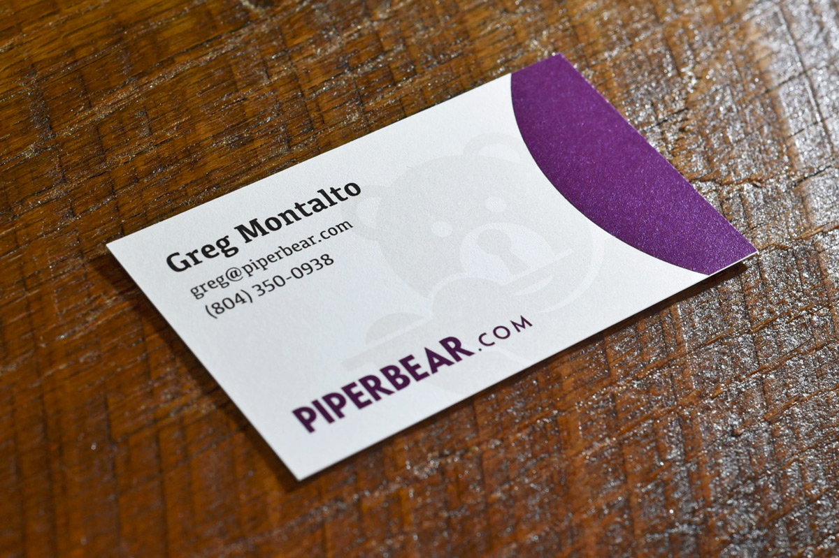
We designed the business cards to include a clear spot varnish of the bear that immediately makes the recipient interact with the card, moving it around so the light bounces off the shiny bear. It adds that extra touch while keeping the design clean and effective, just like their approach to interior design. To complete the project, we designed their real estate yard sign to post in front of their available rentals and renovation/design projects, and also provided Piperbear with logo and color guides – these come in handy when working with vendors to help ensure their brand colors and logos remain consistent.
Phase 2 of Piperbear included the design and development of a brand new website – check it out here.
Creative solutions
Is your business growing and evolving? Do you need help aligning your vision and values with your message and overall brand essence? Let’s chat! Fill out our introduction form and we’ll be in touch soon.